


Hey Adopter,
A lot of you have asked how I create the visuals for this newsletter. Fair question. Most AI content looks the same. Generic stock imagery. Bland diagrams that could belong to anyone. The kind of visuals that scream “I spent 30 seconds on Canva.”
I spend about 15 minutes per newsletter on visuals. Sometimes less. The images you see here, the diagrams, the animated GIFs, they all come from a repeatable workflow I’ve built over months of testing.
Today I’m showing you the entire process. I recorded a video walking through every step in real time. No editing out the mistakes. No pretending it works perfectly every time.
But if you prefer to read, here’s the breakdown.
The problem with most newsletter visuals
Generic visuals kill credibility. Your readers scroll past them. They add nothing. Worse, they signal that you grabbed whatever was convenient rather than creating something that actually reinforces your message.
Custom visuals do the opposite. They make your content memorable. They create a recognisable brand. They show you give a damn.
The old way of solving this meant hiring a designer or spending hours in Photoshop. Neither works when you’re publishing weekly.
The problem with most newsletter visuals
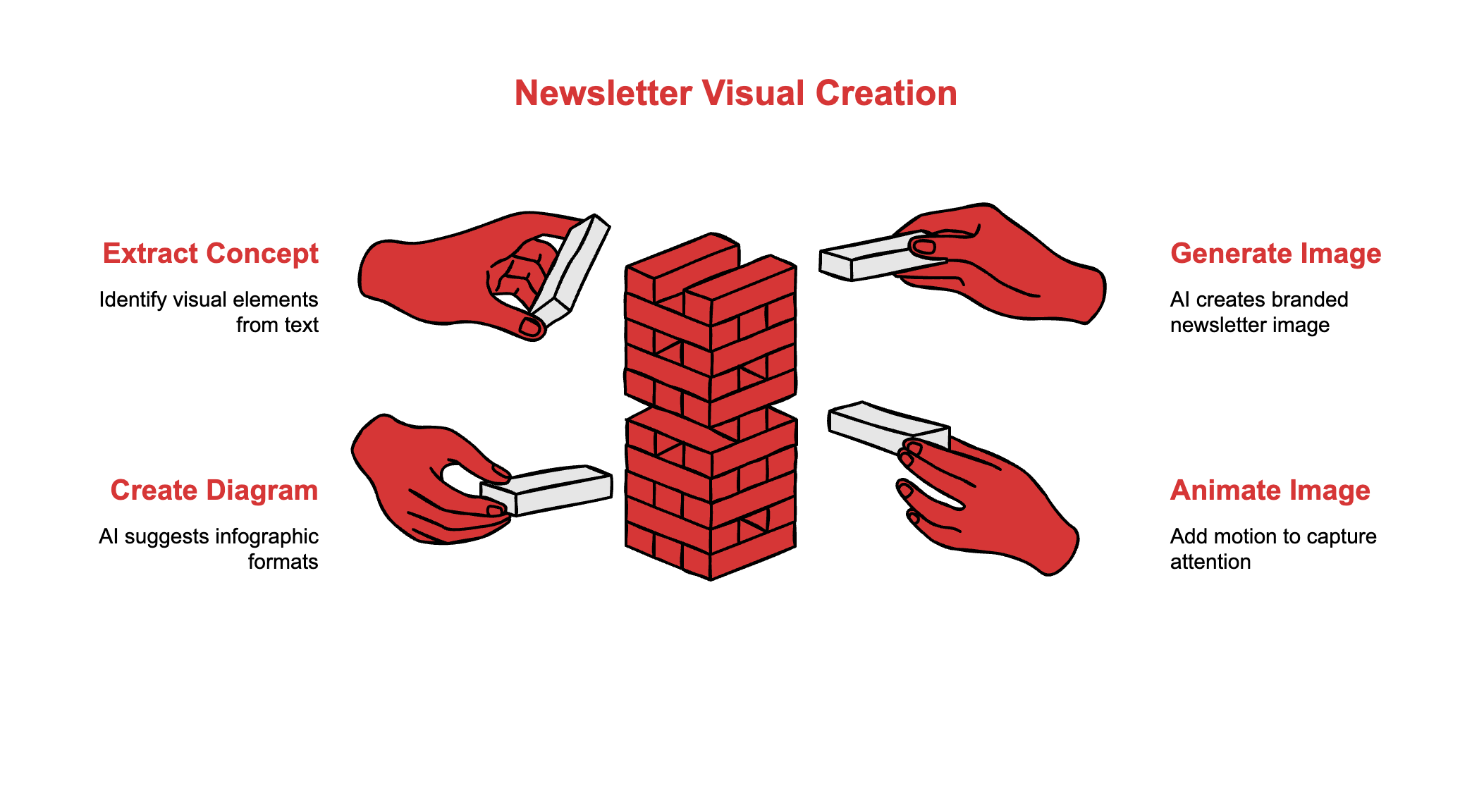
My entire visual workflow runs on five tools. Each one handles a specific job.
Claude generates the initial image concepts. I paste my newsletter content and ask it to identify the core visual idea. It returns three text prompts I can use for image generation.
Google Gemini creates the actual images. I’ve set up a custom Gem with my brand guidelines, colour palette, and reference images. When I paste a prompt, it produces visuals that match my newsletter’s look.
Napkin.ai handles diagrams. Paste any text, highlight a section, and it generates infographic options automatically. The iceberg diagram, the flowcharts, the comparison visuals, they all come from here.
Grok (Imagine) animates static images. Drag and drop an image, and it automatically generates motion. No prompting required, though you can add instructions for more control.
EasyGIF converts animations to lightweight GIFs. I keep them under one megabyte so they load fast and don’t bloat your inbox.
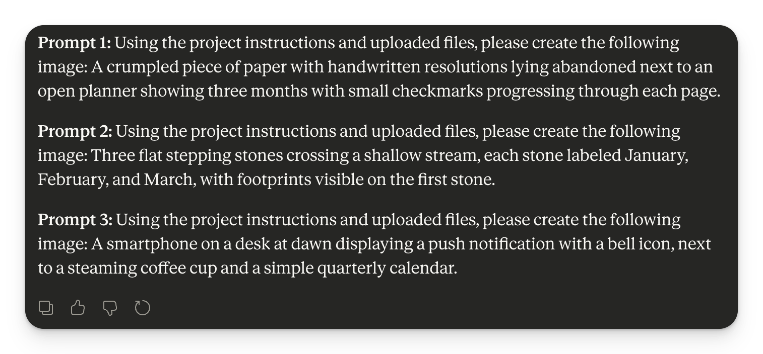
Step one: extract the visual concept
I copy my newsletter draft into Claude. Then I run a prompt I’ve saved in my RightClickPrompt extension. The prompt reads the content and identifies which visual elements would clarify the central idea at a glance.
It returns three options. Something like:
A crumbled piece of paper with handwritten resolutions lying abandoned next to an open planner
Three flat stepping stones crossing a shallow stream, each labelled with a month
A simple quarterly calendar with red accent marks
I pick whichever resonates most with the article’s core message.
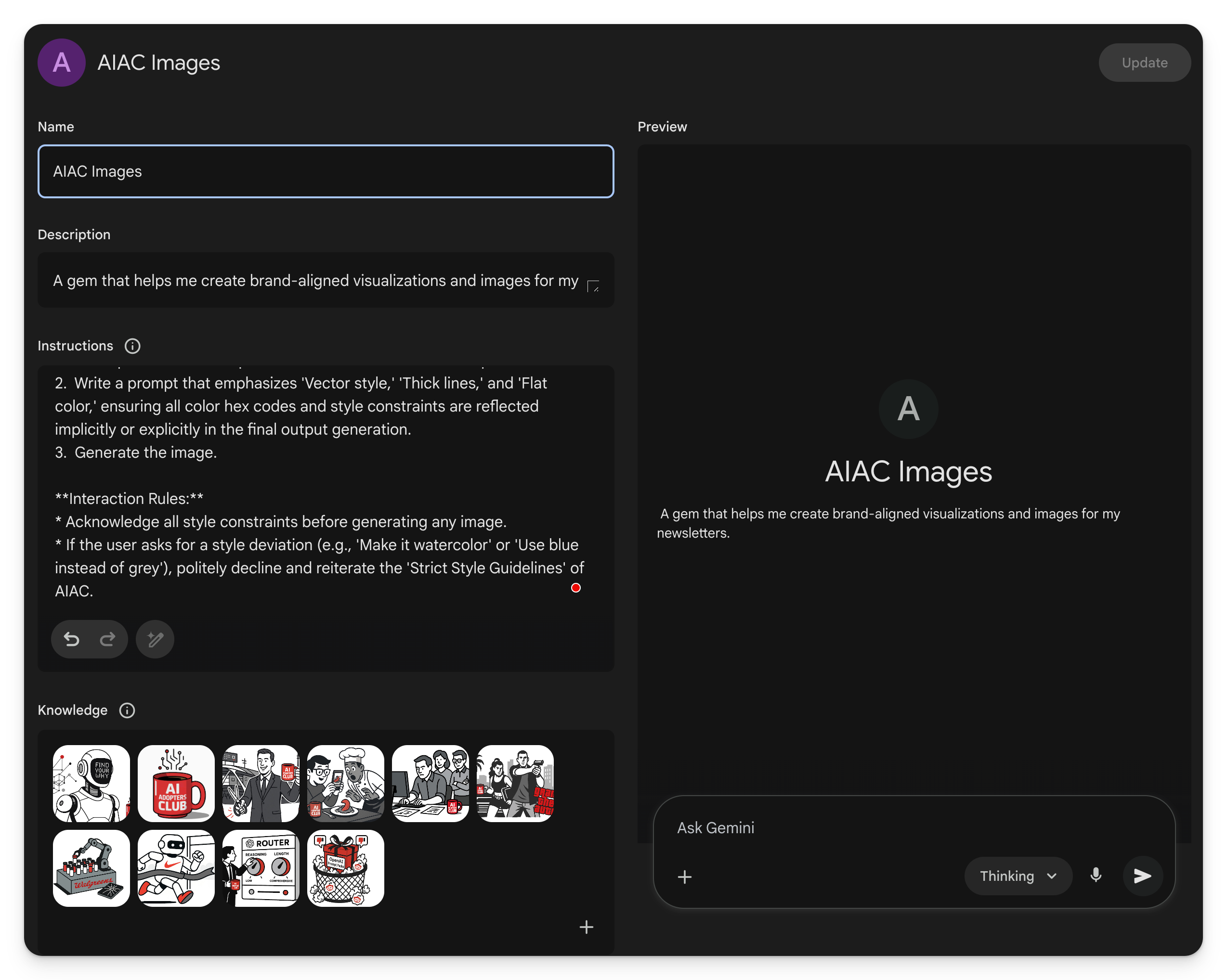
Step two: generate the image
I’ve built a custom Gem in Google Gemini called “AIAC Images.” Think of it like a custom GPT but for image generation.
The Gem includes:
My brand’s visual identity guidelines
Colour palette specifications
Dimension and texture preferences
Reference images uploaded to the knowledge base
The red mug rule, because brand consistency matters
When I paste a prompt from Claude, Gemini produces images that already look like they belong to my newsletter. No more fighting with generic outputs that need heavy editing.
ChatGPT’s new image model works too. I tested both in the video. Gemini currently handles brand consistency better for my use case.
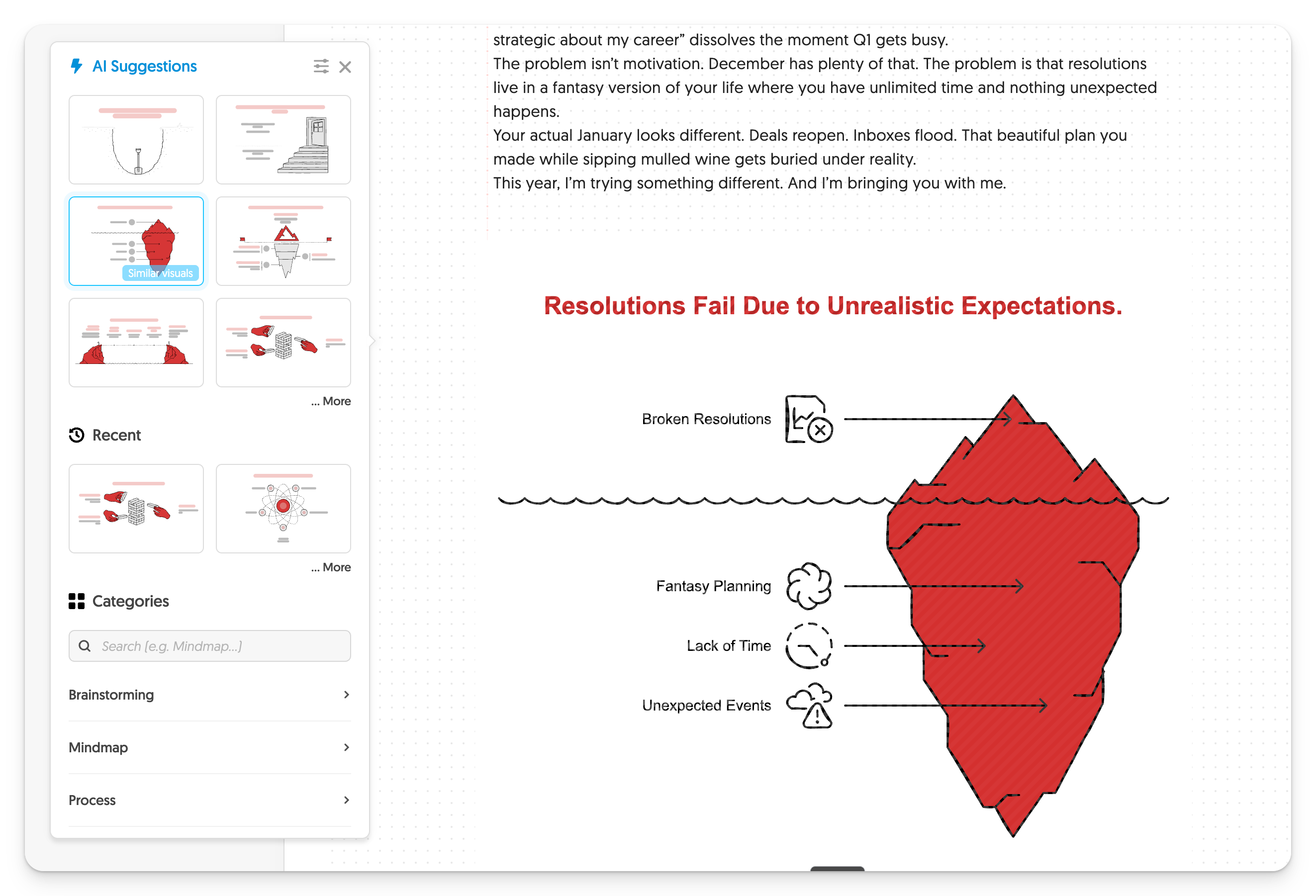
Step three: create the diagrams
Napkin.ai changed how I think about explanatory visuals.
Paste your newsletter text. Select a paragraph. Click generate. It automatically suggests infographic formats based on the content structure.
Writing about hidden factors behind a problem? It might suggest an iceberg diagram. Comparing options? A side-by-side chart. Showing a process? A flowchart.
You pick the format, adjust the styling to match your brand colours, and export directly to your clipboard. Paste into your newsletter editor. Done.
Step four: animate when it adds value
Animation catches attention in crowded inboxes. But heavy video files kill load times.
Grok makes this stupidly simple. Drag and drop your image, and it starts animating automatically. No prompt needed. If you want more control, you can add instructions, but the default output usually works.
Then I run the video through EasyGIF to convert it to a compressed GIF. Scale it down, keep it under one megabyte, save.
The animated header you see at the top of some newsletters? That’s the result.
Why this workflow works
Speed matters. If creating visuals takes an hour, you’ll skip them when deadlines hit. Fifteen minutes is sustainable.
Consistency matters more. Every visual reinforces brand recognition. Readers start to recognise your content before reading a single word.
The tools handle different jobs well. Claude thinks conceptually. Gemini executes visually. Napkin structures information. Grok adds motion. EasyGIF compresses for delivery. Each tool plays to its strength.
The prompts that make it work
The quality of your outputs depends entirely on your prompts. Here’s what I feed Claude:
1. Read the article in full.
2. Identify the core concept or key theme of the article (e.g., a single idea, a central topic, a main point).

3. Propose a single object, or up to three related objects/characters, arranged in a simple scene, that symbolically represents the main idea. Make them very clear and easily understandable.

• The objects should clarify the central meaning at a glance.
• Avoid unnecessary details or sub-themes—keep it minimal and direct.

4. Do not include any stylistic instructions (e.g., no mentions of realism, watercolor, futuristic, etc.).

5. Output Format:
Prefix to each of the 3 prompts: “Using the project instructions and uploaded files, please create the following image:”
Simple. Specific. It forces Claude to distill the article down to its visual essence rather than throwing everything at the wall.
What I’d change if starting over
I’d build the Gemini Gem earlier. I spent months manually adding brand instructions to every prompt. The Gem saves that repetition entirely.
I’d also collect reference images from day one. The more examples Gemini has of your visual style, the better it matches your brand. Start building that library now.
Your turn
Watch the full video. See the workflow in action with all the awkward moments included. Then try it yourself.
You don’t need design skills. You need a system. This is mine.
Adapt & Create,
Kamil


