

Claude Design just launched and here is how to test it in an afternoon
Six filled prompts built around one fictional company so you can run the full visual stack in a single session

Can you help Bob?
Try your best and leave a comment if you have questions so we can help each other.
Hey Adopter,
There is a gap every operator knows. You have the idea. You have the numbers. You have the rough shape of what the pitch, the landing page, or the prototype needs to say. And then you hit the wall. The designer is booked two weeks out. Figma feels like overkill for a Tuesday afternoon. Canva templates fight your brand. So you end up in Google Slides at 11pm, dragging text boxes around, producing something that looks half-finished and feels worse.
Anthropic just put a different option on the table.
On 17 April, they launched Claude Design at claude.ai/design. It sits alongside the regular Claude chat as a visual workspace, available to Pro, Max, Team, and Enterprise users. You describe what you need in plain English, Claude produces a first version on a live canvas, and you iterate through conversation, inline comments, and real-time sliders for spacing, typography, and colour. Feed it your brand guide once and every output stays on-system.
That is the pitch. Whether it actually helps your business depends on whether you use it for the right things.
Most coverage of the launch has been breathless product review. Pretty screenshots, “the future of design,” not much you can act on. This edition is the opposite. Six prompts, all filled with real-looking data from one fictional company called FleetPulse, plus blank templates beneath each one so you can swap in your own numbers afterwards. Paste the prompts, watch what Claude Design does, and by the end of your coffee you will know whether this belongs in your workflow.
Let’s go.
What Claude Design actually is
A quick grounding before the prompts.
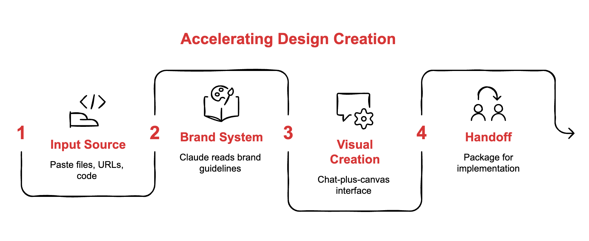
Claude Design is a visual creation layer powered by the new Claude Opus 4.7 model. It produces prototypes, slide decks, one-pagers, landing pages, and branded assets through a chat-plus-canvas interface. You can paste files, URLs, or codebases as source material. It reads your brand system once and holds it across every project. When a design is ready, it packages a handoff bundle straight to Claude Code for front-end implementation, or exports to PDF, PPTX, HTML, or Canva.
The mental model that matters: this is not Figma for everyone. It is a “first useful draft” accelerator. The value is in collapsing the blank-canvas phase, not replacing the full design discipline. Read that line twice before you form expectations.
Meet FleetPulse
Every prompt below is built around the same fictional company, so you can run them in sequence and watch the pieces connect.
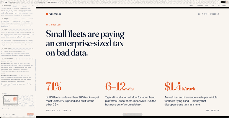
FleetPulse is a fleet telemetry SaaS for small-to-mid operators, 10 to 200 vehicles. It installs in under an hour, cuts fuel costs by around 14%, flags maintenance issues before trucks break down, and scores driver behaviour to lower insurance premiums. Founded 2024, based in Austin, 14 employees, 127 paying customers, $1.8M ARR. Raising an $8M Series A this quarter. Brand colours are deep navy (#0B1D3A), warm orange (#F26A21), and off-white (#FAF7F2). Typography, Inter for UI and Fraunces for headlines. This month they are launching DriverScore 2.0, an AI coaching layer that scores every driver daily and recommends personalised training.
That is enough texture for Claude Design to produce real-feeling output. Let’s put it to work.
Here are all the prompts in RCP
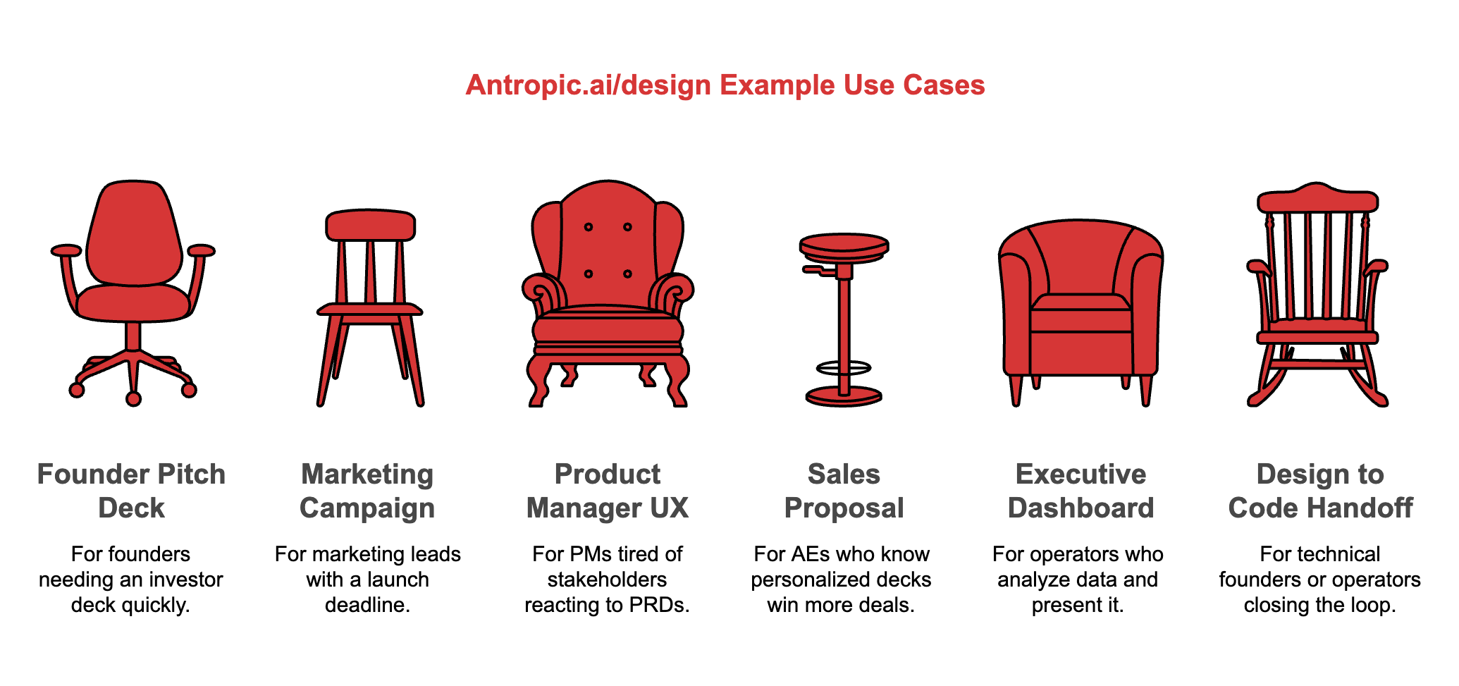
Use case #1: founder pitch deck and investor one-pager
For the founder who needs an investor deck before Thursday.
The filled prompt:
Create a 12-slide Series A investor pitch deck and a matching one-page executive summary for FleetPulse, a fleet telemetry SaaS based in Austin, Texas.
Company facts to use:
Founded 2024, 14 employees, 127 paying customers, $1.8M ARR growing 22% month over month
Customers reduce fuel spend by 14% on average and cut insurance premiums by 9% within six months
Raising $8M Series A to expand the sales team and launch our AI coaching product, DriverScore 2.0
Total addressable market, $27B in North America small-to-mid fleet operations
Competition, Samsara enterprise, Motive mid-market. We win sub-200-truck fleets on speed of setup and price.
Deck structure, Cover, The problem, Why now, Our solution, Product demo screens, Traction, Business model, Market size, Competition, Team, The ask, Contact.
Brand, navy #0B1D3A, warm orange #F26A21, off-white #FAF7F2. Inter for body, Fraunces for headlines. Confident, modern, slightly industrial. No stock photos of people shaking hands. Clean iconography and real-feeling product screenshots.
Also produce a companion one-pager with the same brand system that a partner could skim in 90 seconds.
Your blank template to reuse:
Create a [N]-slide Series [A/B/Seed] investor pitch deck and a matching one-page executive summary for [Company Name], a [one-line description].

Company facts to use:
- Founded [year], [team size], [customer count], [ARR] growing [growth rate]
- Customer outcomes, [primary metric], [secondary metric]
- Raising [amount] to [use of funds]
- Total addressable market, [$X] in [market]
- Competition, [main competitors] and how we win

Deck structure, Cover, The problem, Why now, Our solution, Product demo, Traction, Business model, Market size, Competition, Team, The ask, Contact.

Brand, [primary colour hex], [accent hex], [background hex]. [Fonts]. [Tone notes].

Also produce a companion one-pager a partner could skim in 90 seconds.
Run it once with FleetPulse. Swap in your own facts. Compare how fast it goes from nothing to something.
Use case #2: marketing campaign asset package
For the marketing lead with a launch on Friday and no design bandwidth.
The filled prompt:
Generate a full launch campaign asset package for FleetPulse’s new feature, DriverScore 2.0, an AI coaching layer that scores drivers daily and recommends training.
I need three things in one session.
One, a hero landing page at fleetpulse.com/driverscore with a headline, subheadline, three benefit blocks, a product screenshot slot, a testimonial from a fictional customer called Rogelio at Hatcher Freight saying “we cut hard-braking events by 41% in the first month”, and a primary CTA “Book a 15-minute demo”.
Two, three square social visuals sized 1080x1080 for LinkedIn and X. One stat-led, one quote-led, one product-led.
Three, an 8-slide sales enablement deck account executives can walk prospects through in under 10 minutes.
Brand, navy #0B1D3A, warm orange #F26A21, off-white #FAF7F2. Inter for body, Fraunces for headlines. Modern, trustworthy, a bit industrial. The core promise across everything is “score every driver, save every mile”.
Your blank template to reuse:
Generate a full launch campaign asset package for [company]'s new [product/feature], [one-line description].

I need three things in one session.

One, a hero landing page at [URL] with a headline, subheadline, three benefit blocks, a product screenshot slot, a testimonial from [customer name and company] saying "[quote]", and a primary CTA "[CTA text]".

Two, three square social visuals sized 1080x1080. One stat-led, one quote-led, one product-led.

Three, an 8-slide sales enablement deck for [audience] to use in under 10 minutes.

Brand, [colours and hex codes]. [Fonts]. [Tone]. Core promise across everything, "[positioning line]".
The unlock here is coherence. Three separate tools would produce three different aesthetic feelings. One session produces one voice.
Use case #3: product manager UX prototype for alignment
For the PM who is tired of stakeholders reacting to 14-page PRDs.
The filled prompt:
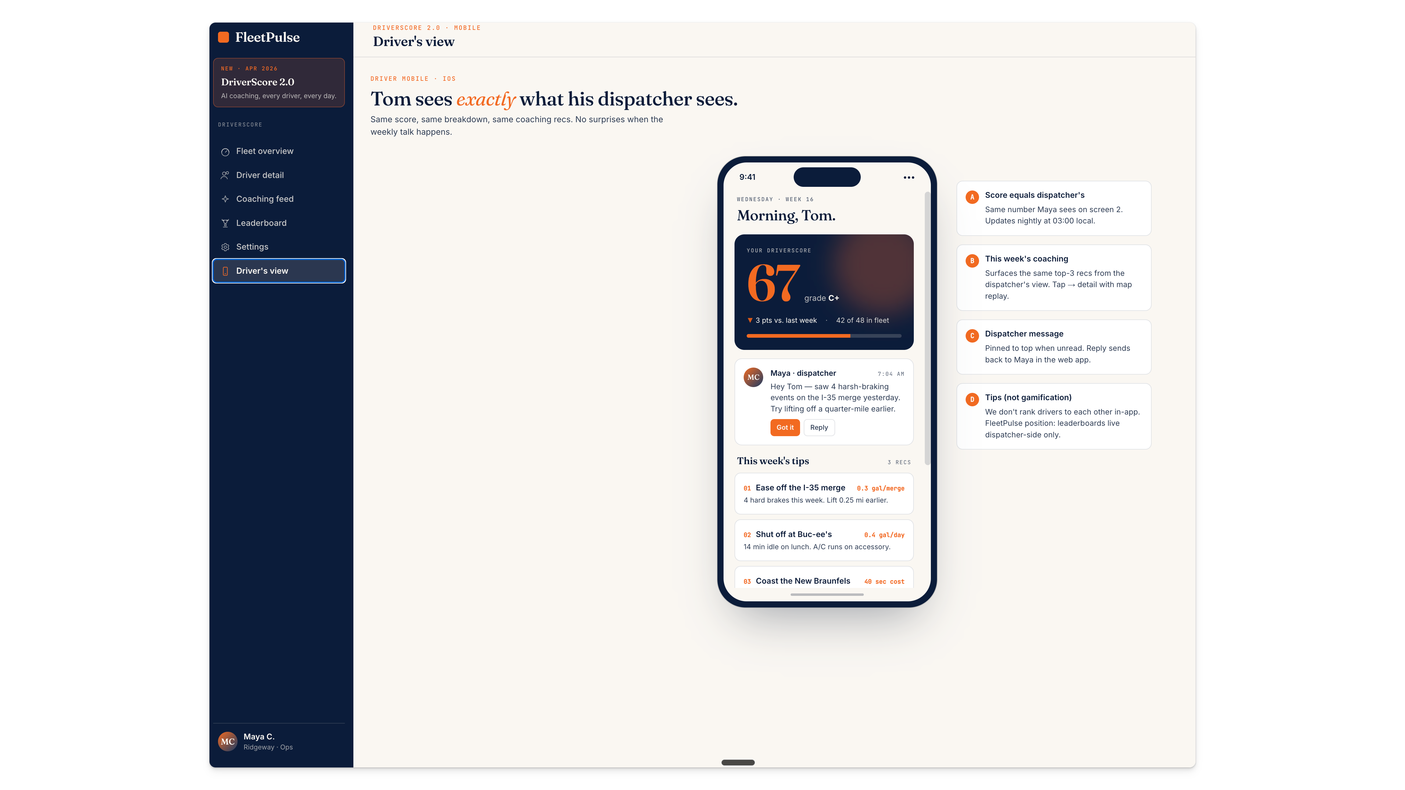
Turn this into a clickable 6-screen UX prototype for the DriverScore 2.0 dashboard inside the FleetPulse web app.
Screens I need.
One, Fleet overview with a score distribution chart, top three risk drivers, and a week-over-week trend. Two, Driver detail view showing score, recent trips on a mini map, top three coaching recommendations, and a “send coaching message” button. Three, Coaching recommendations feed ranked by ROI impact. Four, Leaderboard showing top and bottom performers with weekly change. Five, Settings for scoring weights, notification rules, and team permissions. Six, Mobile view of the driver’s personal score page so drivers see what their dispatcher sees.
Make the nav clickable between screens. Use realistic sample data. Include one empty state so engineering can see day-one behaviour. Brand system, navy and warm orange on off-white, Inter throughout.
This goes to engineering on Monday. Show me where interactions live with hover and pressed states.
Your blank template to reuse:
Turn this into a clickable [N]-screen UX prototype for [feature name] inside [product name].

Screens I need.

One, [screen name] with [key elements].
Two, [screen name] with [key elements].
[Continue for each screen]

Make the nav clickable. Use realistic sample data. Include one empty state. Brand system, [reference].

This goes to engineering on [day]. Show hover and pressed states.
The business outcome is alignment speed. Stakeholders react to something tangible instead of something imagined, which means fewer expensive mid-build rewrites.
Use case #4: customised sales proposal
For the AE who knows personalised decks win more deals but can’t justify the time.
The filled prompt:
Build a tailored proposal deck and a one-page leave-behind for Lone Star Logistics, a 75-truck regional carrier based in Houston, Texas.
Discovery call notes.
They lose approximately $180k per year to fuel theft and unauthorised idling
Insurance renewal is in 90 days and the broker is warning of a 15% premium hike
18% driver turnover last year, mostly new hires who felt set up to fail
Current tech stack, paper logs and a basic GPS tracker from 2019
Decision-maker, Elena Prieto, VP of Operations. Secondary, Marcus Webb, CFO.
Deck sections, Cover with “Prepared for Lone Star Logistics”, What we heard in discovery, The three problems costing you the most money, How FleetPulse solves each one with DriverScore 2.0 screenshots, 90-day rollout plan, Projected savings totalling $417k year one (fuel $280k, insurance $47k, turnover $90k), Pricing with Starter at $49/truck/month and Pro at $79/truck/month with recommended tier highlighted, Next steps with a 15-truck pilot.
Tone, Texan-friendly but data-led. No fluff. FleetPulse brand with a subtle regional nod. Also give me the one-pager so Marcus can forward it to the CEO.
Your blank template to reuse:
Build a tailored proposal deck and a one-page leave-behind for [prospect name], a [one-line description].

Discovery call notes.
- [Primary pain with dollar figure]
- [Timing pressure]
- [Operational challenge]
- [Current stack]
- [Decision-makers and roles]

Deck sections, Cover prepared for [prospect], What we heard, The [N] problems costing you the most, How we solve each, Rollout plan, Projected savings broken out, Pricing with recommended tier, Next steps.

Tone, [industry/regional flavour]. Brand, [your system]. Also give me a one-pager to forward internally.
Do this once per prospect and the time saved compounds across every rep on the team.
Use case #5: executive dashboard for the board
For the operator who does the analysis and then has to spend another afternoon making it presentable.
The filled prompt:
Convert this Q1 business review into an executive dashboard deck and a one-page decision memo for FleetPulse’s board meeting next Thursday.
Q1 numbers.
ARR grew from $1.3M to $1.8M, up 38%
Net revenue retention, 118%
Gross churn, 3.1%, up from 2.4% in Q4, needs a callout
CAC $4,200, LTV $38,000, payback 11 months
Pipeline coverage for Q2, 3.2x
Product, DriverScore 2.0 beta shipped, mobile app redesign in flight
Hiring, closed 3 AEs, 1 senior engineer, 1 CS lead
Risk, two enterprise deals $240k combined slipped from Q1 to Q2
Decision the board needs to make, should we accelerate Series A close by six weeks to fund an aggressive Q3 sales hire plan, or hold and raise on stronger Q2 numbers.
Deliverables. One, a 10-slide board deck, dashboard style, with clean charts and plain-language commentary under each metric. Two, a one-page decision memo with the recommendation, reasoning, trade-offs, and ask.
FleetPulse brand system. The board has 45 minutes. This needs to land in the first 15.
Your blank template to reuse:
Convert this [period] business review into an executive dashboard deck and a one-page decision memo for [company]'s board meeting [date].

[Period] numbers.
- [Growth metric]
- [Retention metric]
- [Churn with trend]
- [Unit economics, CAC/LTV/payback]
- [Pipeline coverage]
- [Product milestones]
- [Hiring]
- [Risk factors]

Decision the board needs to make, [clear binary or multi-option question].

Deliverables. One, a [N]-slide dashboard-style deck with charts and plain-language commentary. Two, a one-page decision memo with recommendation, reasoning, trade-offs, and ask.

Brand, [your system]. The board has [time]. This needs to land in the first [time].
This is the use case that surprised me most when I ran it. The same AI that helps you build the analysis now presents it. The translation tax that usually costs you an afternoon disappears.
Use case #6: design to code handoff
For the technical founder or operator who wants to close the full loop.
The filled prompt:
Take the finalised DriverScore 2.0 fleet overview screen from this project and package it for Claude Code handoff.
Target output, a responsive React component using Tailwind CSS and shadcn/ui, deployable as a static prototype on Vercel. Include the score distribution chart with Recharts, the top three risk drivers card, and the week-over-week trend line. Mock the data in a single data.ts file so it runs locally with no backend.
Include brand tokens (navy #0B1D3A, warm orange #F26A21, off-white #FAF7F2, Inter, Fraunces) as CSS variables. Add comments showing where real API calls will slot in later.
This goes to our front-end engineer tomorrow. Make the handoff bundle clean enough that she spends her time on real integration work, not on reading my mind.
Your blank template to reuse:
Take the finalised [screen name] from this project and package it for Claude Code handoff.

Target output, a responsive [React/Vue/Svelte] component using [styling stack], deployable as a static prototype on [hosting]. Include [specific elements with chart libraries]. Mock the data in a single file so it runs locally.

Include brand tokens as CSS variables. Add comments showing where real API calls will slot in later.

This goes to [engineer] on [day]. Make the bundle clean enough that they spend time on integration, not on reading my mind.
This is the bigger play Anthropic is making. Not just a design tool, an ecosystem that owns idea, visual, and code under one roof.
What Claude Design still cannot do
Being honest about limits builds the trust to recommend the rest.
It will not replace a mature production design workflow with precise component control, versioning, and team collaboration. It will not build the full application stack you need to ship a real product, auth, database, payments, analytics, deployment still live elsewhere. Output quality varies on complex brand systems, especially in research preview. Multi-player collaboration is basic. The editing experience has rough edges Anthropic openly acknowledges.
Use it for first drafts, alignment prototypes, and internal assets. Use it to compress the fuzzy early phase that eats days. Do not use it to replace your designer on production work that ships to customers.
Your 30-minute test drive
Here is the actual ask.
Block 30 minutes on your calendar this week. Open claude.ai/design. Run prompt one (the FleetPulse pitch deck). Watch how fast you go from nothing to a branded 12-slide deck. Then run prompt three (the UX prototype) and watch stakeholder-ready screens appear. Then swap FleetPulse for your real company and run prompt two (the campaign assets) or prompt five (the board deck) against a real deliverable on your calendar this month.
If after 30 minutes it has not earned a permanent place in your workflow, you’ll know. If it has, you’ll know that too. Either way, you stop guessing and start knowing, which is the point.
The gap between idea and polished visual has been the single biggest friction point in business communication for a decade. Claude Design is the first serious shot at collapsing it for people who aren’t designers. Run the test. Report back.
Adapt & Create,
Kamil